Refreshing COOL-A-BAH: A Bold Yet Seamless Logo Evolution to Reflect Growth
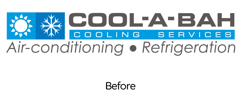
COOL-A-BAH is a well-established business that originally focused on air conditioning but has now expanded to include Refrigeration and Electrical as core services. Their previous logo no longer represented what they do, limiting their brand’s impact.
The challenge? Refresh the logo without losing customer recognition.
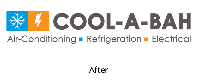
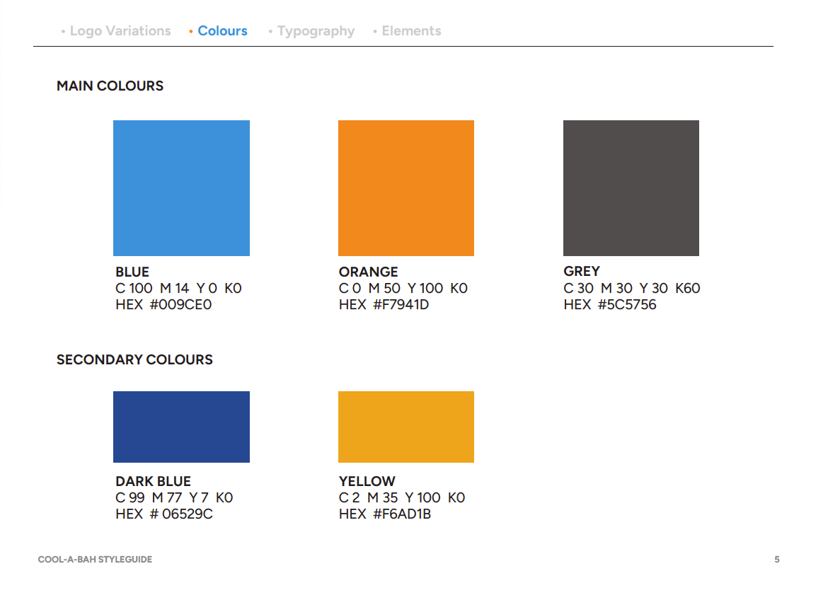
To achieve this, I introduced a bold touch of orange, changed the font to something more modern, and replaced one of the icons to represent their electrical services.
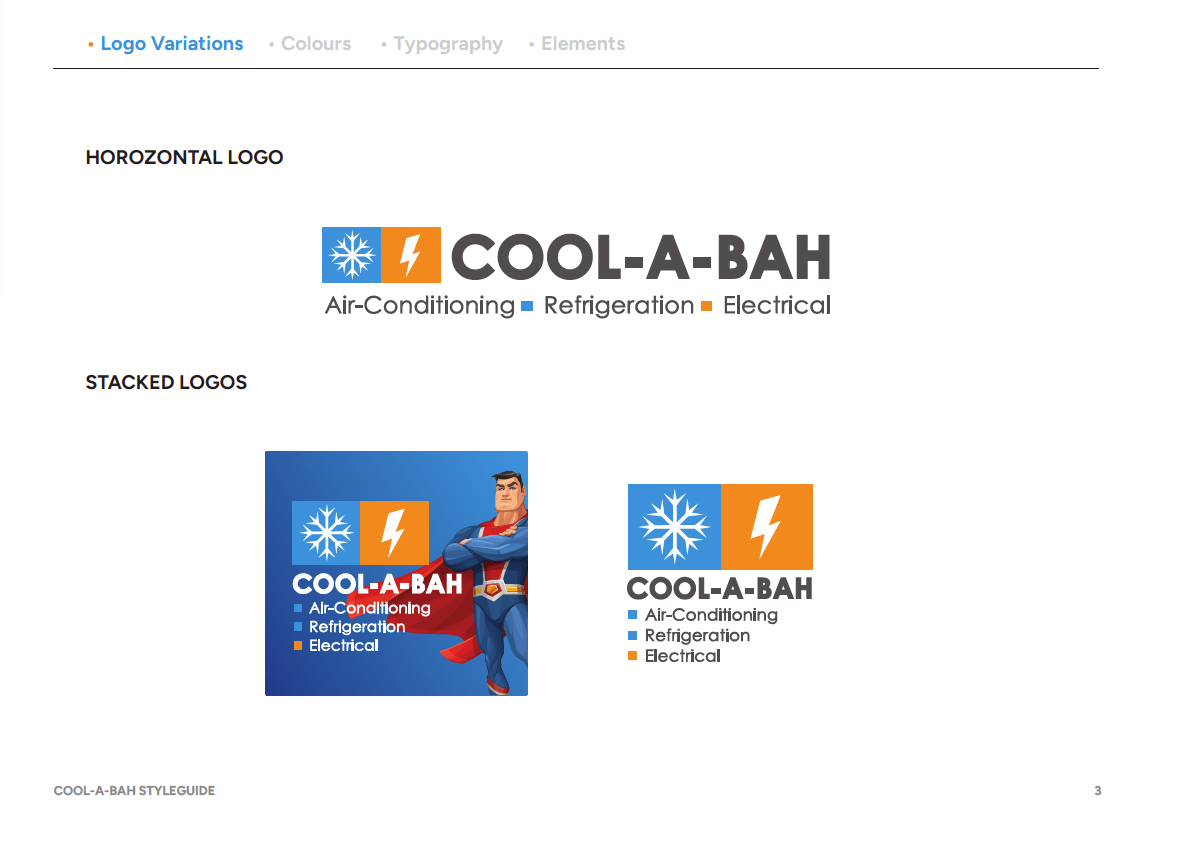
The result? A seamless evolution that fits effortlessly within their existing branding—subtle enough to maintain familiarity but now fully aligned with their expanded services.
Because sometimes, a small but strategic change makes all the difference.
